My original idea was to have the new logo mimic the iconic dance moves inspired the Village People's "YMCA" music video. A rough sketch was drawn on paper, before being transferred to Adobe, digitized, and colored.
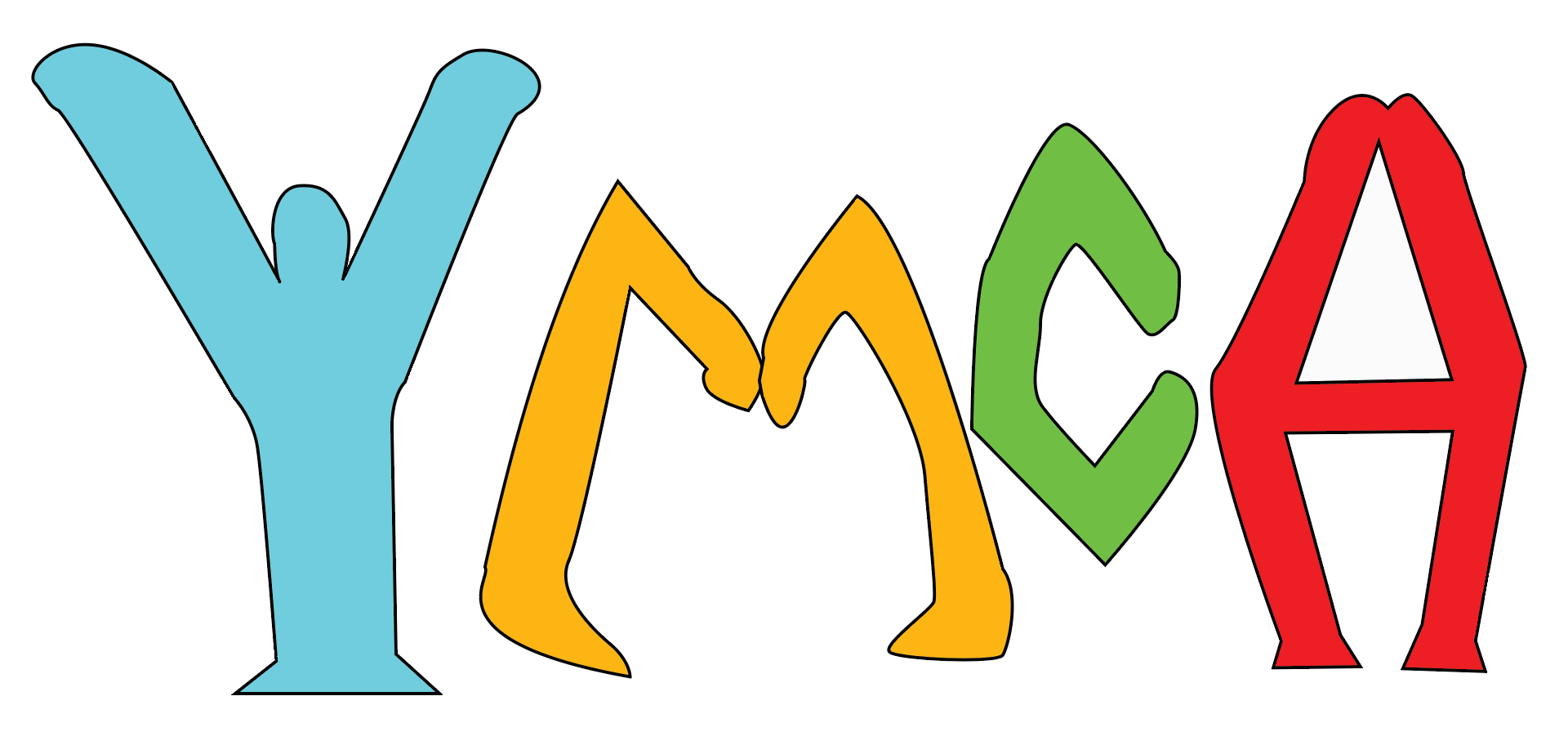
Upon initial critiques, I changed the logo concept to make the letters mimic the dance moves, as opposed to having the dance moves mimic the letters. I went back to the drawing board, and again to Adobe, and made this rough concept.
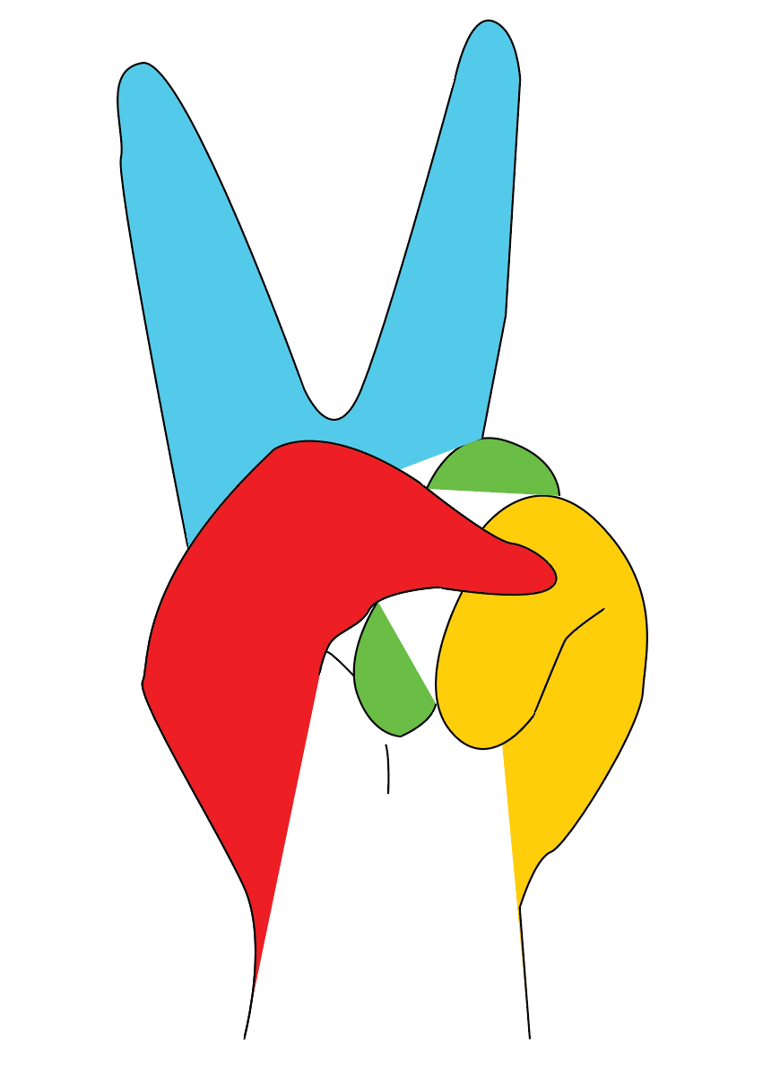
When asked for a more simplified design, I noticed that my "Y" looked a lot like a peace sign, so I decided to make a rough concept based on that, while also incorporating the original colors from the previous iterations of the design.

After refining the design, by incorporating an actual "Y" within the logo and changing the color scheme to the blue and purple the current YMCA is using now, all that was left was having it go through one final round of critiques.
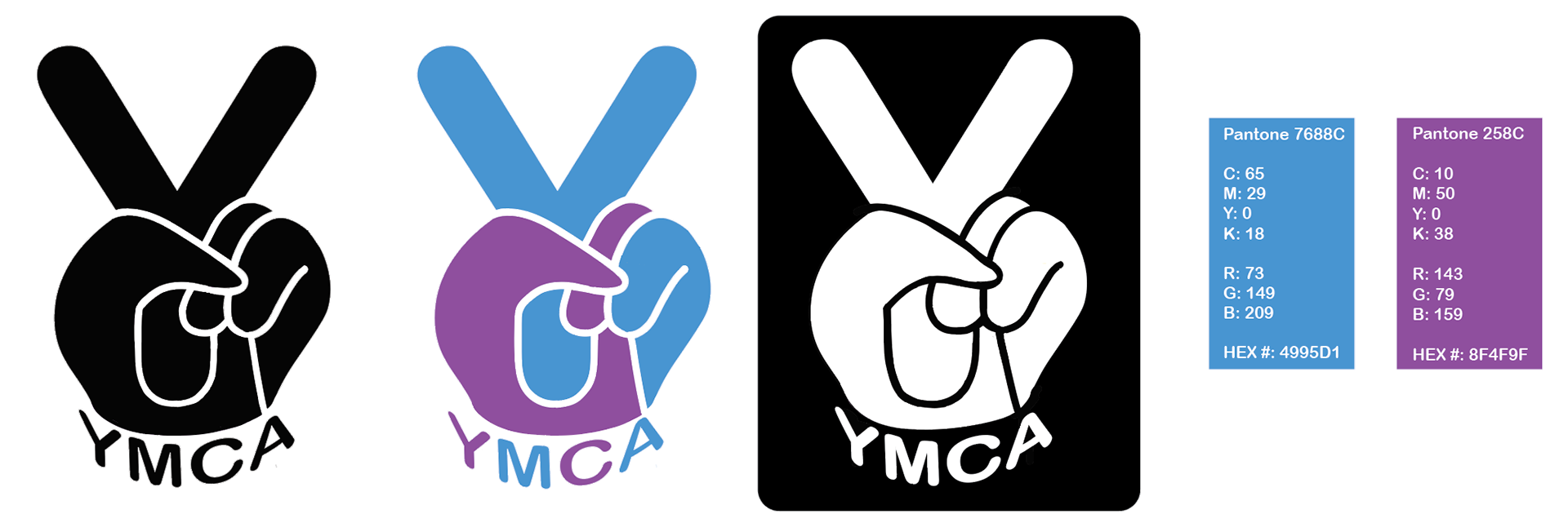
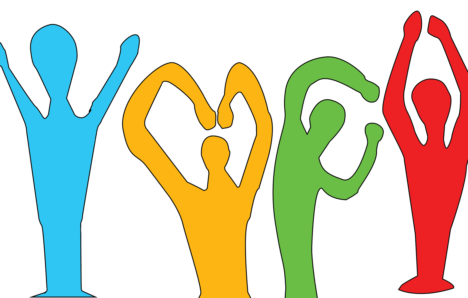
With filling in the bottom to have the overall image resemble a hand, along with curving the "YMCA" around the bottom of the wrist, the final version of the logo created within Adobe Illustrator was complete.
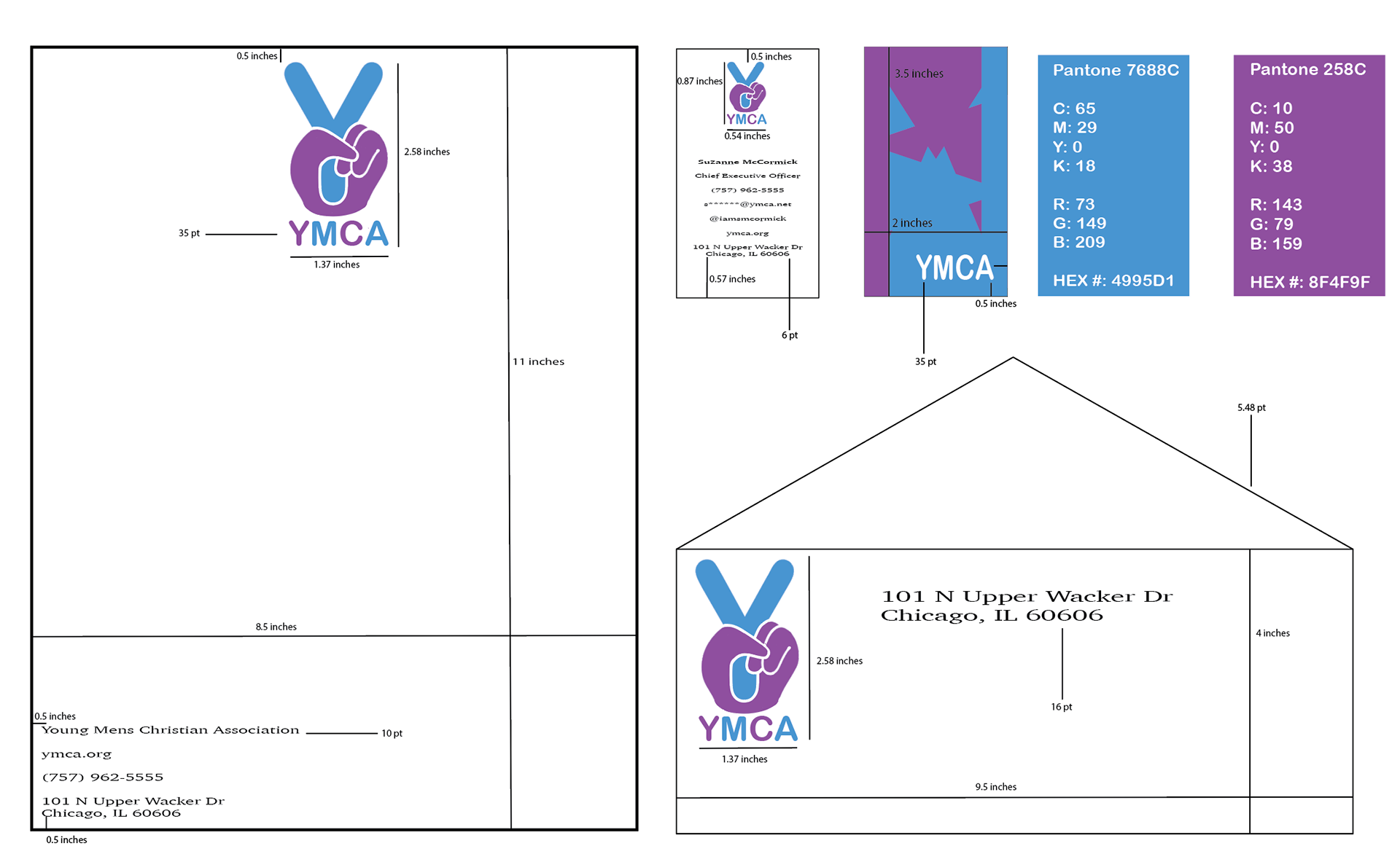
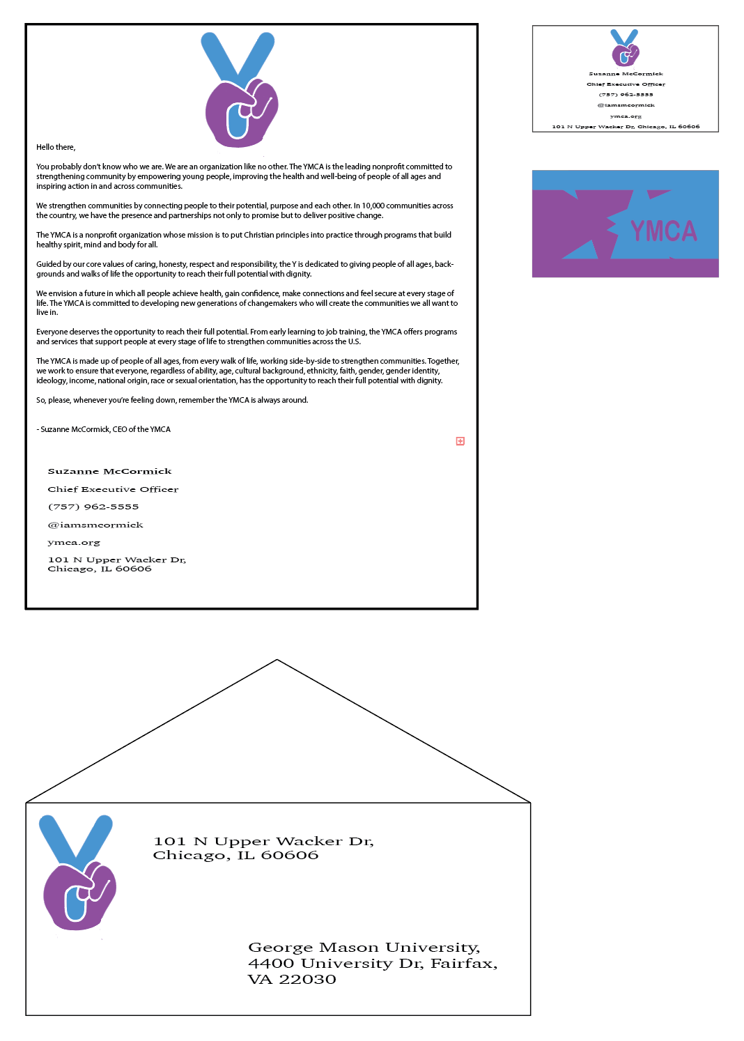
The next step was to incorporate the new logo and its colors into items people in a company would use, such as business cards and letterheads. I also calculated the measurements for where exactly the logos needed to be positioned.
After clearing up the measurements and doing a few minor changes, the final product was ready to be used, not just on letterheads and cards, but on shirts, buttons, vehicles, and anything else the YMCA would be using

The final version of the logo.
If you're ever interested in having me designing a new logo for you, give me a call!